This is the first article in a series describing what I learned. I spent more than half a year of my learning time on this topic and tried different approaches. In the past I found myself a different topic to research each year. Previous topics included Scheme and Architectural Refactoring. Currently I am investigating Splitting the Monolith. This makes me leave my research kind of unfinished - probably it is impossible to "finish" learning at all. I want to collect what I have learned during last half year before diving into something else.
The Exercise
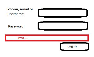
To experiment with Test Driven Development of user interfaces, we need some UI to build. What would be a small UI that most people know? A login dialogue. I created a repository to drive the UI of a Login Form using TDD, the Login Form TDD UI kata. Your task is to create a Login window or form or web page. Here are the requirements:
Existing Code Back End
The exercise is focused on the front end part. Let's just assume an
Authentication service, facade or end point which will be simulated in the tests. It has a method authenticate() to authenticate a user based on her phone, email or user name and her password. The call returns an AuthenticationResult which indicates success and an optional message for error situations. From now on the combination of a user's phone, email or user name is called the user's lookup. Under certain conditions, the UI logic will invoke this service or back end. Calls to the back end might take some time and/or block, so these calls must done asynchronously to keep the user interface responsive.Requirements for the Minimum Functionality
- There is a user name input field, which is limited to 20 characters.
- The label "Phone, email or username" is left, next to the input field.
- There is a password field, which is limited to 20 characters.
- The password is either visible as asterisk or bullet signs.
- The label "Password" is left, next to the input field.
- There is a "Log in" button in the bottom right corner of the window.
- There is a label in a red box above the button. It is only visible if there was an error.
Authentication back end described above.- When user name and password are given, button "Log in" is clicked and the back end reports success, then the form is closed.
- When user name and password given, button "Log in" is clicked but the back end reports an error, a message in the error line is shown and the form stays open.
- While the back end is working, the "Log in" button is disabled.

More Requirements
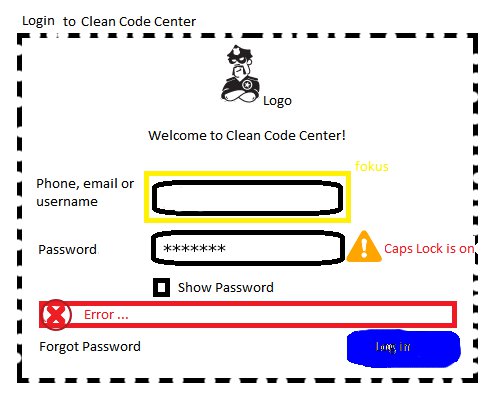
The goal of the kata is to experiment with driving the UI using tests. Maybe you want to ignore the styling (most people do) or ignore the visual elements completely. Or maybe you want to focus specifically on styling. Clearly we need more requirements like
- More functionality while the back end is working
- More logic in the view itself when username or password is not given
- More UI elements like titles and logos
- Detailed styling of all elements
- Focus and tab order
- Checkbox to show password
- Caps Lock Warning

Drive the UI of a Login Form using TDD
I created this kata to explore test driving UIs: login-form-tdd-ui-kata. Currently it contains code to get started in the following languages and UI frameworks:
- Java/Swing
- Java/Vaadin
- Kotlin/Android
- Go/raylib-go
- JavaScript/plain browser DOM
- JavaScript/React


No comments:
Post a Comment